How Bridge-Tails Emerged in the Pulkovo Airport Logo
The new logo for Pulkovo Airport, presented by Artemy Lebedev's studio, has sparked controversy. The article covers how the design and font were chosen.
Apr 21, 2026 0


Source:
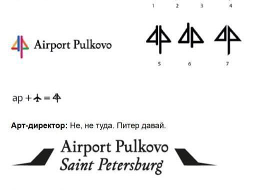
Discussion of the new Pulkovo Airport logo, presented on September 30, continues on social media and in comments from the publication Fontanka. Artemy Lebedev«s studio, which developed the symbol, explained at the presentation the main references: airplane tails, drawbridges, the letter »L« for Leningrad, and »A« for airport.
Source:
However, the negative reaction was predictable due to Lebedev«s controversial reputation, the high cost of his company»s services, and years of irony over the Moscow Metro logo, which many found too simple. «Air Gates of the Northern Capital» clarified that the logo merely updates a 12-year-old design.
Source:
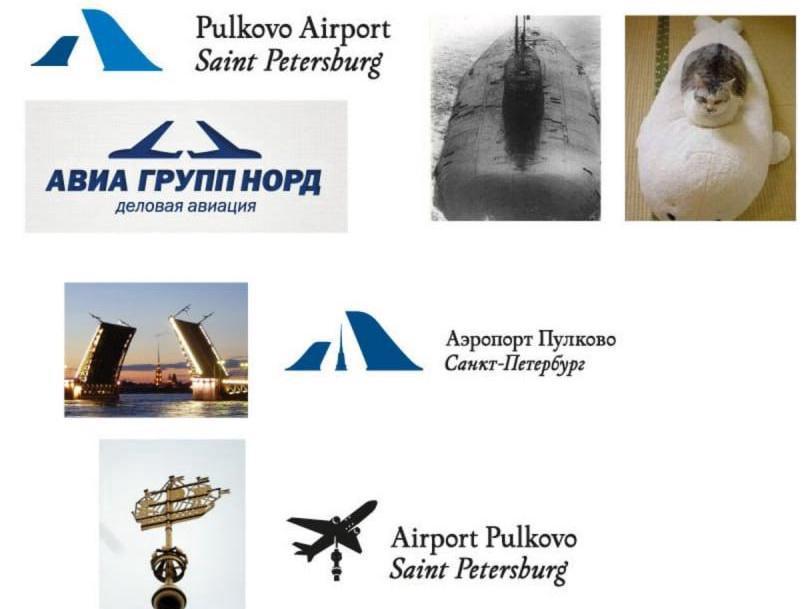
Critics point to the stereotypical idea—using drawbridges for St. Petersburg and airplane silhouettes for an airport—and to the unsuccessful, in their opinion, font, which they call outdated and clashing with the overall look.

Source:
Lebedev Studio is known for its openness: on its website, even during development, they published not only the semantic justification for the logo but also a simplified description of the creation process. A dialogue between the art director and the typographer is provided.
Source:
The art director asks for an antiqua typeface similar to Dutch and civil script, but without fanaticism. The typographer shows options, receiving responses: «No, let»s keep going,« »Nope,« and finally, »Yeah«—when a suitable option is found. The final font was described as »something our own, modern, only hinting at Dutch antiqua.« In parallel, they developed the inscription »Hero City Leningrad,« but it was postponed.
Choosing the graphic symbol wasn«t easy either. Initially, options with geolocation and the Latin letter »P« were considered, but the art director rejected them: »Nah, not that. Let«s do Peter.» After approving the idea with drawbridges, the command followed: «Wow, excellent. Let»s add perspective: one wing big, one in the distance.« Then came the thought to make the bridges more like airplane tails, experimenting with shapes of Soviet and Western airliners.
A problem arose: the client noticed a resemblance to the logo of «Avia Group Nord.» The designers countered that there are many logos with bridges in St. Petersburg, and the competitor has wings, not tails. In parallel, alternative options were presented, such as an airplane instead of the Admiralty«s ship, which helped secure agreement.
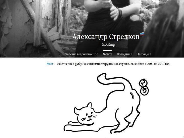
The art director on the project was Artemy Lebedev himself, and the direct executors were designers Alexander Strelkov and Vladimir Pavlenko. Strelkov«s portfolio includes over 150 projects and an award for designing the polar passport. Many presentations in his portfolio are accompanied by humorous poems. Fontanka cites some of them, for example: »Don«t look askance, bargaining is out of place. The best wheels are at the store TORK.» Another example: «And don»t read between the lines—that«s a path for a sick head. In the logo—a beautiful flower, not what you thought»—this is for the company Sexguru. Alexander Strelkov is also noted in the «Brain» section on the studio«s website, where personal ideas of employees are collected. There, his piggy bank »To the Cat Under the Tail« is presented.
Read more