Artemy Lebedev unveils new Pulkovo Airport logo


The presentation of the new logo for Pulkovo Airport took place on January 30, with designer Artemy Lebedev as its author.

As Lebedev explained, the emblem contains several layers of meaning.

Visually, it combines stylized airplane tails, indicating high passenger traffic, and silhouettes of drawbridges.
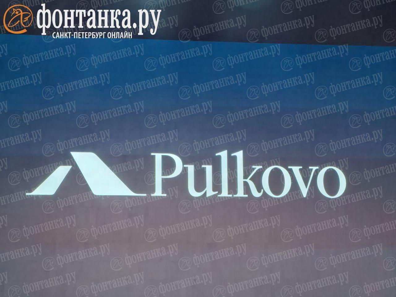
This is a symbol of St. Petersburg; people fly in to see them,
the designer said.
Additionally, an «Easter egg» is included in the symbol: its shape resembles the letter «L,» which is a reference to the historical name «Leningrad.»
The font used in the logo, according to Lebedev, refers to the civil script introduced during the era of Peter the First.
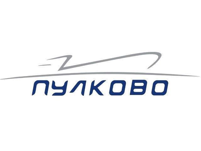
The designer also assessed the previous version of the Pulkovo logo, noting that it resembled a «submarine.»
The development cost is not disclosed by agreement with Artemy Lebedev Studio. General Director of the managing company «Air Gates of the Northern Capital» Leonid Sergeyev called the amount «comfortable.» He clarified that it was actually a refinement of a logo created by Lebedev 12 years ago but not previously used by the airport.