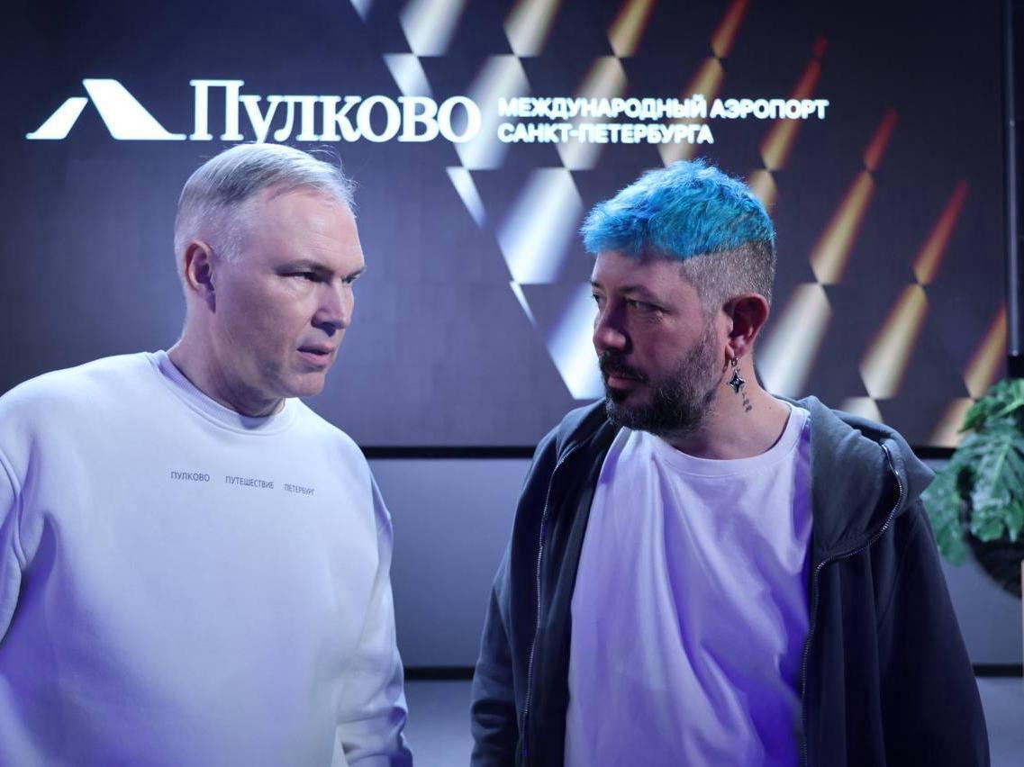
Pulkovo Airport's new logo by Artemy Lebedev draws mixed reviews

Online debates continue over the new symbol of Pulkovo Airport, created by Artemy Lebedev Studio. Users compete in wit, finding unexpected interpretations in the emblem, though the updated image has pleased some.
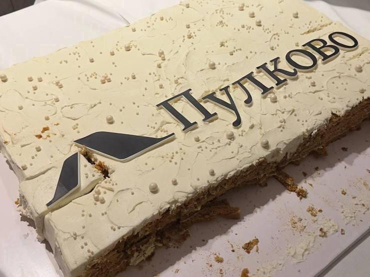
The airport«s management company updated the logo on social media on January 30. Artemy Lebedev explained that he embedded several meanings into the design. According to him, these are airplane tails, meaning intensive air traffic, drawbridges as a recognizable symbol of St. Petersburg, and the letter »L« — a reference to the word »Leningrad.« The font, which may seem unusual, refers to the civil font of Peter the Great. The development cost under the contract terms is not disclosed, but the airport called it »very comfortable,« since the work was essentially a refinement of a version created 12 years ago.
Criticism of the new logo
Some residents of St. Petersburg found the logo overly simple and primitive. «Brilliant, any schoolchild could draw that for two ice creams,» noted one commenter. «Did a child draw it?» asked another.
Many paid attention to the font. «A stupid font with serifs like the Chinese used in the 90s,» wrote one user. «The logo by itself is okay, the font by itself is okay. Together, they don»t match,« clarified a third.
Some claim that the embedded symbols are hard to read. «I saw the airplane tails, then the bridges. ... But the letter »L« — I»d see that last,« said a commenter.
Critics also doubt the appropriateness of the chosen meanings. «The symbol of aviation in Russia is the tail of an airplane. And where did everything else go?» wondered one participant in the discussion. «An airplane tail is like a hole in a donut,» agreed another. A third noted ironically: «So the bridges are drawn, the subway is closed, you can»t get anywhere? Not the best meaning for an air port.«
Some Petersburgers do not see the need to change the logo. «And why was it necessary to change the logo? ... Did they find extra money?» asked a commenter. Others fear that the rebranding costs will lead to an increase in airport services. «When can we expect the next parking price hike?» asked one resident.
Unexpected associations
In the new symbol, some discern completely different images. «It looks like two carpet runners. Or two sheets on which royal decrees were written,» suggested a user. «Am I the only one who saw the runways in the logo, a top-down view?» asked another.
Comparisons were made with the monument «Broken Ring,» the logo of «Lenfilm,» and the emblem of the football club «Lokomotiv.» Some saw a play on words: «»Lupkovo« — a play on letters, just rearranged, and what, given the range of flights and prices, it sounds quite fitting.»
There were also more grim interpretations. One commenter jokingly compared the elements of the logo to two hacksaws: «The image of two hacksaws in the logo — a large and a small one — unmistakably reminds one of the infamous practice of dismemberment, historically associated with the city»s criminal environment.«
Positive assessments
The new logo also found defenders. «Crystal clear (the tail part of the plane and the drawn bridges), an interesting logo. What don»t you like about it?« wondered one user.
«The bridges turned out beautiful, with perspective,» admired another. «Quite good, and the embedded meaning is easily read!» added a third.
Some liked the reference to the historical font. «Very cool and fresh, a skilled work with the text part — a reference to the Petrine font,» noted a commenter.
«Cool! And really, I saw the airplane tails, and the bridges, and the letter L, even without reading the text,» shared a participant in the discussion. Others acknowledged the work as successful: «A beautiful base font, lettering, and intersection of meanings. I am glad that the dreary existing logo will be replaced by beauty.»